Most of us get our ideas about innovations in web design by stumbling upon something cool on someone else’s site and then trying to figure out how they did it. Every once in a while, however, it pays to find out what other designers think is cool. Fortunately there are some very savvy designers out there who are more than happy to share their observations.
Doing a quick search for trending topics in web design I stumbled upon an article written by Jake Rocheleau titled ‘Web Design: 20 Hottest Trends To Watch Out For In 2014’
While the title of the article might lead you to think this is just a list of trends the author found interesting, it is actually a very good resource for finding the tools required to incorporate those ideas into your own designs. Jake gives lists and links to the tools used to create just about everything he talks about.
The article also discusses design concepts, not just coding tricks and techniques.
The article is quite extensive and I’m not about to try and list everything the author mentions but I did find a few items that caught my eye.

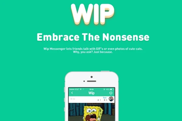
Number four on the list is Deeply-Focused Landing Pages. According to Jake, “Software developers often purchase a domain name and launch a website as a marketing tool. This idea has since expanded to encapsulate mobile games, open source scripts, smartphone apps, really any digital product you can imagine. These landing pages are basically essential to encourage prospective customers into learning more about a product before buying.”
Jake’s number eight is the trend toward including personal portraits. As he says, “Simple portfolio websites are often my favorite. You want to convey a bit about yourself, where you’ve been, and showcase your work samples. But to keep people truly interested you need to form a human connection. One of the best ways to accomplish this would be including a sample photograph of yourself somewhere on the page.”

“Andrea Mann uses a photo which encapsulates much of the homepage. This is also blended into the darker background and recolored to shades of B&W. It looks fantastic, although you don’t need to use large background portraits on your website. Even a small photograph in your homepage or about page offers visitors a glimpse into who you are.”
There is a lot of good stuff in the article – stuff that you can actually use – so check it out. You can find the full article here.


