As a web development agency, some might argue that your team is only as good as its tools.
Years of experience, design strategies, creative flair — all these factors can be severely limited if you’re working with a mediocre platform that lacks the right capabilities.
If you want to remain competitive in this industry, you can’t afford to settle for anything less than the absolute best. That’s why, in this post, we took the liberty of comparing two of the top platforms that web design agencies should choose: Duda and Webflow.
But first, a little introduction.
Duda
Our first contender is a fully customizable, white label-able platform (more on this later) that allows agencies to efficiently create virtually limitless website management environments all day long.
With Duda, developers, designers, and marketers have full control of facets beyond website creation — from analytics reports to workflow management to client relationships to content personalization to SSL certificates to progressive web apps.
Despite being packed with features that can blow most website platforms out of the water, Duda manages to make the user experience as streamlined and smooth as possible.
Webflow
Just like Duda, Webflow is a comprehensive platform that offers web design agencies with all the features that their clients need to build a solid online presence.
A highly flexible solution, Webflow attempts to fuse the versatility of a traditional CMS and the user-friendliness of modern page builders.
At first glance, both Duda and Webflow emphasize the value of usability in the web development process. With everything going on in a developer’s busy work week, a platform that consolidates key activities in a seamless and accessible manner is most welcome.
However, there can only be one winner in this standoff. So without further ado, let’s drill down into the key features that set Duda and Webflow apart in the agency web development landscape.
1. Asset Management Features
Much of the website development process involves collecting and organizing different pieces of content to create something cohesive.
As simple as it sounds, maintaining an organized and functional library of website assets is harder than you think. After receiving a green light on a proposal and overseeing client onboarding, the first challenge web design agencies need to contend with as part of their project workflows is content collection — acquiring the necessary assets for site creation from clients.
Webflow has a very straightforward approach when it comes to asset management. From the main dashboard, head to the “Assets” tab, where you can manually upload photos, videos, and other graphics.
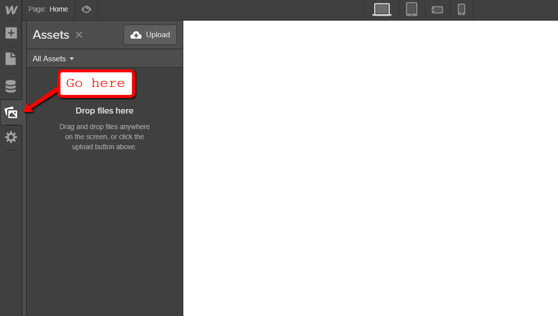
Once uploaded, all your assets can easily be added to your page designs. However, Webflow’s lack of tools that expedite the collection of content from clients can be seen as a major flaw, especially for agencies that juggle multiple projects at once.
Fortunately, this is exactly what Duda can accomplish with the premade content collection form. All you need to do is send the link to your clients and have them upload the assets themselves.
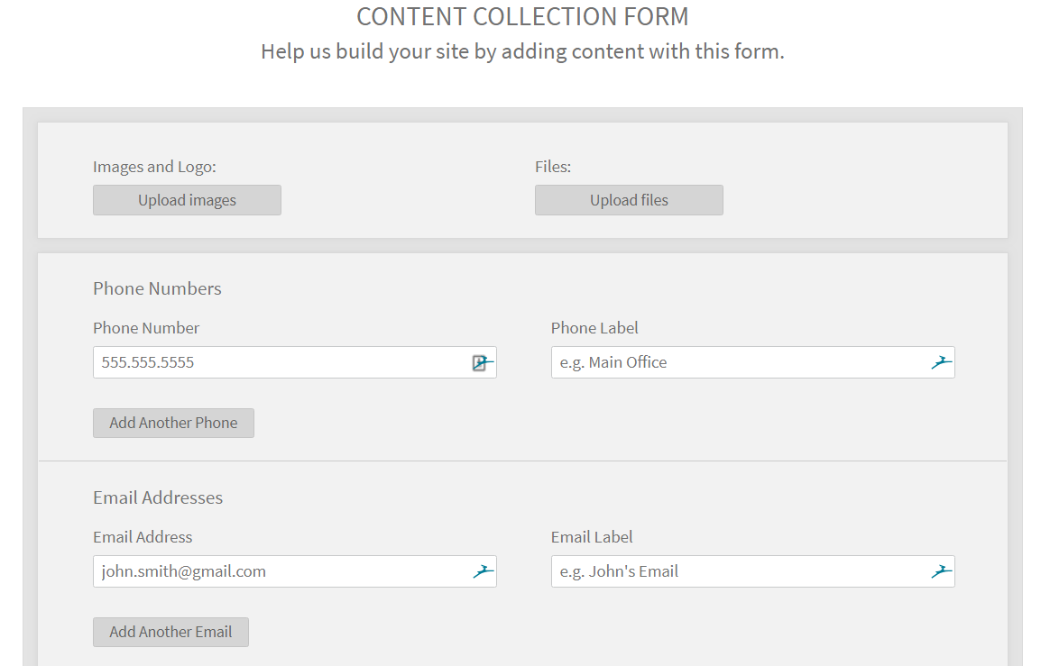
The best part is, it’s dead easy to pull off as well. Your clients just tick a few boxes, upload their files, then hit the save button, and you’ll have access to it all in your libraries. You can even automate client communications about asset collection using their white labeling features.
It’s a no-brainer.
Winner: Duda
2. Themes
When taking website platforms for a spin, the first thing developers and designers might look at are the available themes.
Should a developer decide to use one, the finished product usually barely resembles the original theme by the end of the project. Still, you can’t ignore the tremendous amount of time you can save by utilizing a theme to lay out the basic structure of a website.
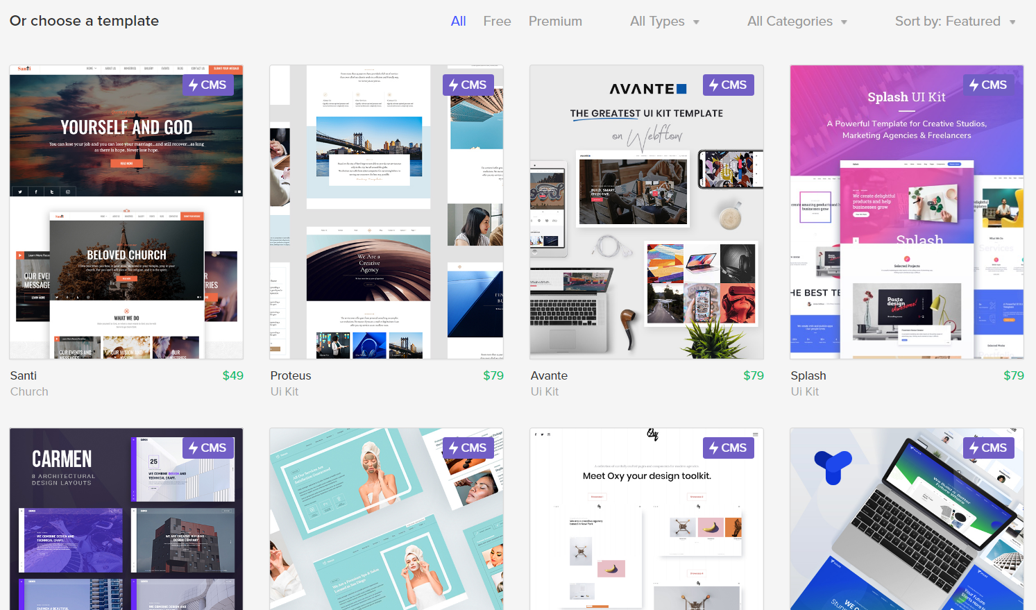
Duda’s wider range of free, professional-looking themes gives it a slight edge over Webflow in this department. The theme selection experience is also more intuitive — thanks to the options that allow users to filter selections based on parameters like dominant color and industry.
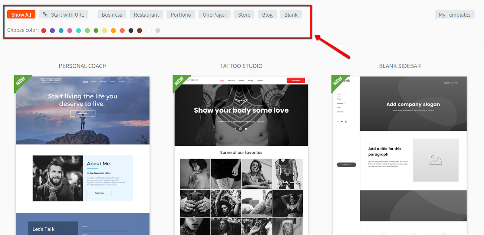
Another convenient feature users get when using Duda is the ability to save personal designs, making them available as templates for future projects. This allows them to cut their website build times, all while still being able to create a stunning website for their clients.
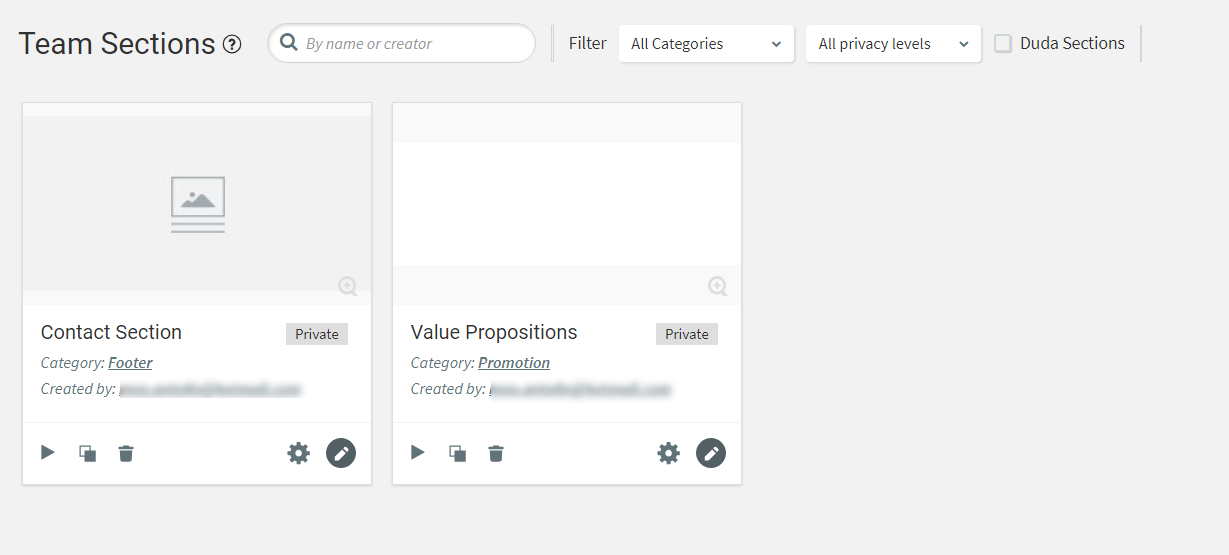
What’s even more impressive about the Duda platform’s approach to themes is the support for modular sections. These are reusable configurations or design block templates that can be used over and over again in different pages and projects, and even assigned to specific team members for management.
To be fair, Webflow’s own gallery of themes is impressive in its own right. But other than the variety of designs, it doesn’t have any noteworthy, theme-related features that can match what Duda does — not to mention that most themes come with a premium price tag.
Winner: Duda
3. Web Design Usability and Power
After selecting a theme, developers and clients will spend the bulk of their time on the core interface or dashboard, where they will perform all sorts of activities.
The site editor’s sidebar will be a Duda user’s best friend. From there, your agency’s designers can switch to editing different pages, insert content straight from the asset library, or add functionality with the help of custom widgets.
Duda also offers a powerful content personalization engine, whereby popups, different content blocks, calls-to-action and design variations are triggered to surface depending on website visitors’ browsing history, referring marketing campaigns, locations and timing factors.
And the source code for all of these elements, in addition to their style sheets (controlled via CSS) can easily be tweaked or edited in Duda.
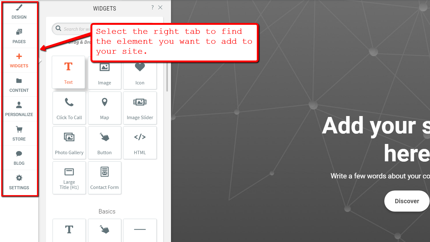
Webflow, in comparison, offers a straightforward editing experience when it comes to content, for better or worse.
Although it offers pretty much the same level of capabilities as the Duda interface, it’s not as user-friendly due to two things: the number of elements displayed on screen and the lack of labels for navigation buttons. This makes it a tad harder to find the features you need if you’re new to the platform.
It’s worth pointing out, however, that it’s easy to export and work with website source code from Webflow, because the code is clean and well-structured. They also allow users to further develop site code by exporting it out of the platform.
Unlike Duda, though, Webflow doesn’t allow you to modify code within their platform, which can be a deal breaker for some users.
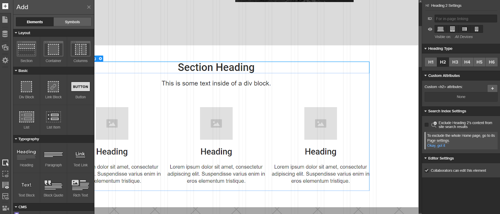
Webflow offers several dynamic and innovative animation options for creating immersive, engaging sites. If you’re coming at it as someone inexperienced in web development, however, you might find the platform slightly overwhelming.
The preset animations at your fingertips do offer enough versatility to create responsive pages that respond to microinteractions such as mouse movements or scrolling up and down.
On the other corner is Duda, with its parallax animation and design elements tailored for newbies and experienced web developers alike. The platform makes it easier to create beautiful and responsive websites in half the time it would take using other platforms.
Winner: Duda
4. Team Management
Collaboration is just as important to a web design agency as it is to other companies.
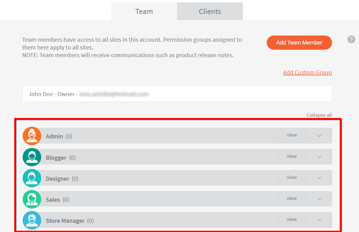
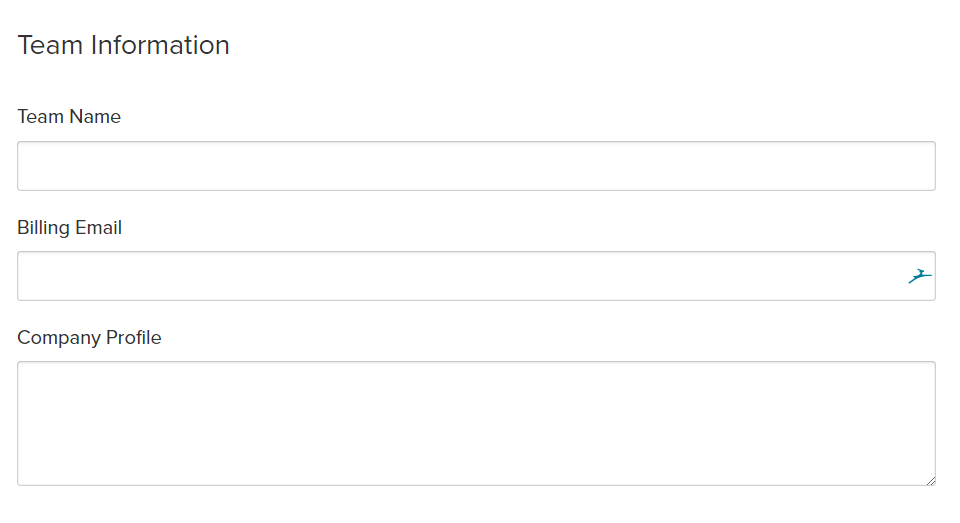
This time, Duda takes a distraction-free approach and rolls client and team member account management into one place. Agency-side admins have granular control over custom permissions for all stakeholder roles from one dashboard.
Individual permissions can also be granted to members by assigning them to a group. They can be administrators who have full access to everything Duda has to offer, bloggers who can add posts, designers who can edit the site’s appearance, and so on.
Webflow also offers team management support that allows up to eight users to work on the same projects.
If you’d like to create a plan for a much bigger team, they’ll offer a custom rate calculated according to the number of members you’d like to add. You’ll then be prompted to invite the desired members via email address.
Being able to remove team members is an expected function. But what makes Webflow’s team management support extra handy is the ability to transfer ownership of a team from one member to another.
This makes it easier to deal with possible changes such as the redesignation of responsibilities.
Winner: Draw
5. Extra Features
Finally, it’s time to compare Duda and Webflow in terms of the extra functionality they bring to the table.
Since Duda is designed as an agency platform, you can customize certain branding elements that clients and team members can see in the editor interface. This includes the dashboard’s logos, button colors, background images, and existing codes for extended functionality.
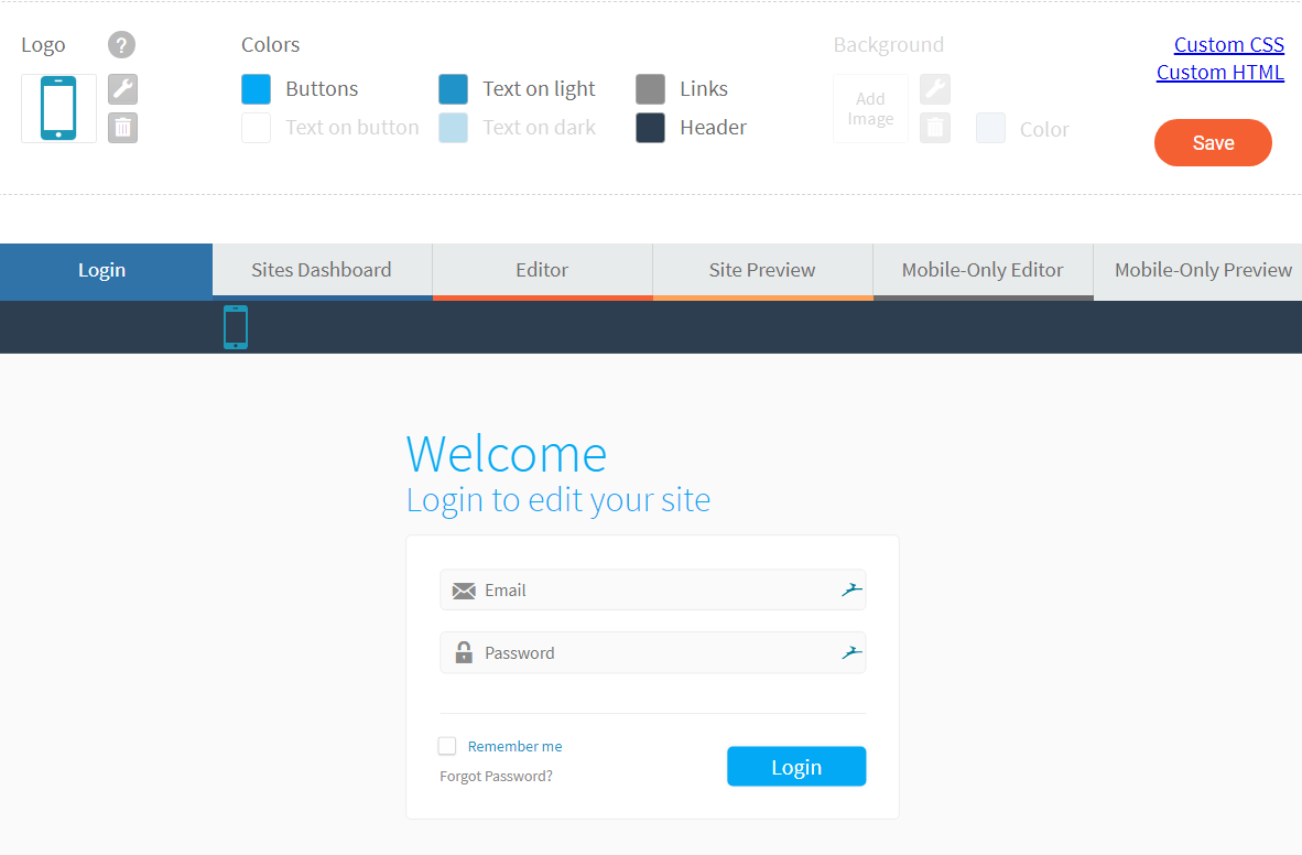
DudaPro users may also opt to automatically dispatch weekly white-labeled analytics reports via email, which is something they can change in the Manage Users Section. It’s basically an all-in-one platform that makes it easy to provide continuous value to clients long after their sites launch.
The added value businesses can gain from this is clear, considering how weekly insights may be used in A/B-testing and deciding on approaches that lead to extended project lifecycles.
On the other hand, Webflow doesn’t offer much on their back-end customization. The platform’s white labeling feature, however, allows you to add your brand’s name and logo on the content managing system (CMS). While useful, it still can’t compare with Duda.
What we do appreciate from Webflow is their right sidebar that gives you quick access to advanced settings and formatting options for the on-screen elements.
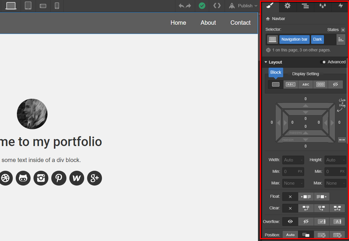
Moreover, their extensive selection of fonts, templates, and premade CSS styling properties also allow for more flexibility in terms of website design. This makes Webflow a dream sandbox for web designers who want to let their creativity loose.
The Duda website builder also comes with an eCommerce solution that produces desktop- and mobile-compatible viewing. However, if you’d like to use custom code that relies on content from HTTP servers, it won’t work in an SSL website. To use code from HTTP servers, you’ll have to request HTTPS-friendly code from your code provider and have HTTPS disabled on your Duda site.
As an experimental feature, Duda also offers a progressive web app (PWA) option at no additional cost, delivering a smoother and faster experience for mobile audience members, adding app-like functionalities and even offline access to content.
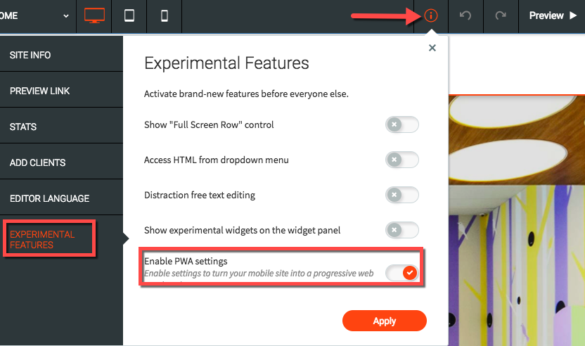
Duda’s PWA solution is a perfect example of how the company strives to think ahead of competing website building platforms.
Another noteworthy service Webflow offers is SSL hosting, which, unlike Duda’s SSL certificates, come with a “threat monitoring” solution. All websites that are SSL secured gain more favor from search engines, while at the same time reassuring site visitors their information remains safe.
From a management level, agency users will also appreciate Webflow’s automated client billing feature. You can have it set to bill your clients at a specific time every month, and set the price they pay.
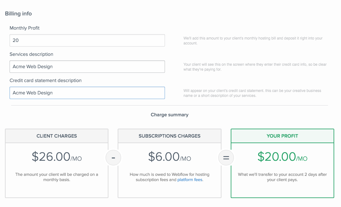
Filing taxes is also made more convenient, as Webflow sends you a 1099 tax form after you’ve provided them with your tax ID. This billing and bookkeeping feature isn’t something you’ll find with Duda, giving Webflow a competitive edge in this category.
Winner: Draw
Conclusion
Webflow has a lot of potential that solo developers and small teams can definitely take advantage of. But in the end, Duda simply offers a far bigger bang for your buck.
Not only does Duda have a more streamlined and robust team management feature, it also grants agencies the ability to create immersive branded experiences for the clients they collaborate with.
Usability-wise, Duda’s learning curve is also a lot smoother because of the clearly-defined navigation and minimalistic toolbar design. Webflow’s interface, on the other hand, can sometimes be confusing and overwhelming to new users.
That being said, the overall winner of this comparison is Duda.


