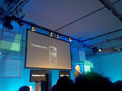
Research In Motion did a less than stellar job pointing out why its new Blackberry Torch is better than the iPhone or Android at a media event in New York today, but once we actually saw the device in action we think that it just might be.

We just got our first hands-on look today at the phone that’s supposed to be Blackberry’s answer to the new mobile climate. It’s now the dinosaur in the room, as a mobile OS that’s been around for over 20 years next to a couple of sexy new players.
Listening to RIM and AT&T executives talk about the Blackberry Torch and the new Blackberry 6 platform, you would have thought they were completely behind the curve. They glued to buzz phrases like “universal search” and “multitasking,” hardly anything new for smartphones these days. Especially given how Jobs unfairly attacked the Blackberry Curve just a couple weeks ago, there should have been some direct swipes at the iPhone.
We went to see this phone put to the test for some live demos, expecting to be completely underwhelmed, but instead were very surprised at how much more fluid and aesthetically pleasing everything was. What impressed us was not that there are a bunch of brand sparkling new features but rather that it does the same stuff as Android and iOS, but in a much better way.

For example, Android has “universal search,” letting users type in a phrase and get immediate results based on anything it finds on the phone: contacts, downloaded apps, media files, etc. However, the results are shown in a clunky text-based list. Blackberry 6 brings up icons in real time, and also searches online content as well as stuff stored on the phone.
Another example is the way it handles social network feeds. Like Android’s Motoblur, it syncs information from numerous sites like Faceboook and Twitter, but not only can Blackberry 6 link to more accounts than Android, it also seamlessly integrates each social network with additional, dedicated apps. So if you see that your friend Julie posted something interesting to her Facebook wall, you can click on that item and it will open up the phone’s Facebook app – no more waiting for a mobile Facebook site to load, no more closing out of a social network aggregation app to open up a separate Facebook app. It’s all done seamlessly. By the way, posting content to your social network is simple, too. Just type in what you’re thinking and touch the Facebook or Twitter icon, and it’s done.

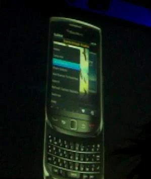
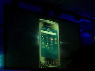
One other aspect of the Torch that is better to see in person is just how sleek it looks. It has a vertical-sliding keyboard, which we haven’t seen in too many handsets. The screen is crystal sharp and everything looks so much better than it ever has on Blackberry, and this is coming from someone who really can’t stand the Blackberry interface.
Unfortunately, there is no support for the latest mobile Flash, but the entire webkit with HTML5 technology is open to developers. That opens up all sorts of possibilities for mobile apps, and let’s face it, Blackberry has kind of fallen to the position of a footnote in the current mobile app environment. Blackberry 6 will try to change that with a brand new centralized app store, just like the one on the iPhone or the Android Market, which even allows for carrier billing so you don’t need to go through the hassle of pulling out your wallet just to buy a 99-cent app while you’re on the bus.
We only spent a few minutes trying out the new Blackberry Torch, but we were definitely impressed. On paper, the feature list looks like nothing more than a souped-up version of Android, and in practicality… well that is kind of what it is. However, it upgrades all of those features so well that we’re convinced Blackberry 6 will be a formidable competitor in the new smartphone market.


