Did you know that there are almost 2 billion websites online right now?
Think about it. That’s a lot of competition. So, the question is, how are you going to stand out?
Adding a content slider to your website is one of the easiest ways to immediately capture the attention of your visitors.
Just take a look at these 8 stunning content slider examples…
#1 Flower Shop Template from Smart Slider 3

Flower Shop is one of the wide variety of content sliders that you get with Smart Slider 3 – WordPress slider plugin created by NextEnd. It has two call to action buttons, a grey one and a peach one, and an interesting navigation where navigation bubbles are stacked vertically on the left side. It is a perfect content slider for ecommerce stores!
#2 Tea Round

Tea Round’s content slider is lighthearted and fun. The text immediately conveys what the app is all about. You can also see how the app would look like on your iPhone screen. Plus, navigation buttons are numbered as steps, which makes the navigation very easy and straightforward!
#3 Regent College

Regent College’s content slider combines both static and dynamic elements – the main section of the slider remains fixed while the image and the text in the black box change as you click through the slides. Creative!
#4 Open Society Foundations

Open Society Foundations’ content slider is dominated by photographs that each reflect a particular social issue. Moreover, the images are given more prominence by blending the background and the slider image together. Interesting, right?
#5 Gaillard Foundation

Gaillard Foundation’s content slider perfectly blends the power of photography and the power of copywriting. The images convey the atmosphere of the place, meanwhile the text explains it’s message. Also, pay attention to how the call-to-action button pops in the overall colour scheme, and how there is nothing to distract you from it. Well done!
#6 Mr. Money Mustache

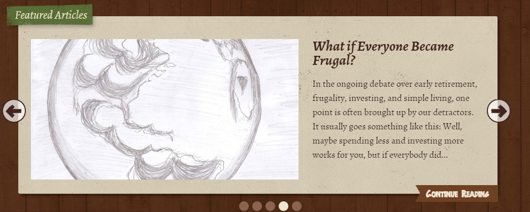
Mr. Money Mustache’s content slider is clean and simple. It works great for showing off the most popular articles on the blog so that the new readers who want a taste of Mustachianism could easily find a way to get started. Note how, besides the navigation bubbles, there are also navigation arrows as well, which helps less tech-savvy readers to use the slider.
#7 Malcolm Reading

Malcolm Reading’s content slider is particularly interesting because there is no way to interact with it. Yes, you’ve read that right, the slideshow that shows off their work is automated, and the visitors can’t move through the slides by clicking on them. It’s an unusual and bold decision!
#8 Design Royale

Design Royale’s content slider is beautiful and elegant. The blue background works great with the white font colour. The call-to-action “View Work” button is especially well done because it really pops in the overall colour scheme. Also, pay attention to how navigation bubbles have titles, which makes using the slider easier!
Conclusion
Many people are sceptical about content sliders.
That’s understandable. After all, like with any visual effect in web design, it’s easy to botch it. But you have no intention of doing that, right?
The fact is that content sliders are a great way to immediately capture the visitor’s attention and convey your message. Remember, every second matters!
So don’t hesitate. Give it a try. Your website will look more lively and dynamic!


