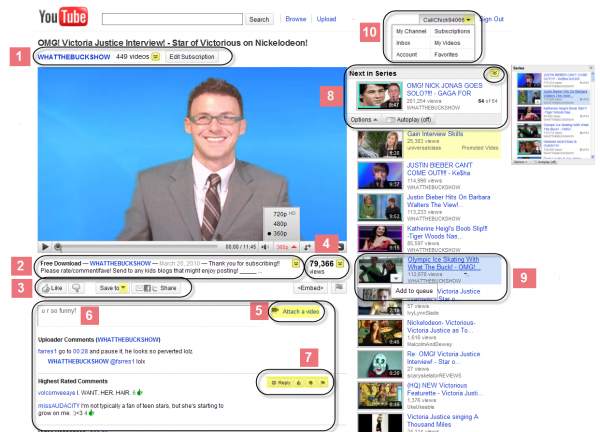
It’s social media makeover week! Just a couple days ago, Twitter totally revamped its home page and now YouTube has completely rebuilt the design of its landing site and video playback interface.
Now, when users open up a video, the layout of media related to the video is completely different from what hundreds of millions of users had become used to.
Some of the most notable changes are:
– Video description now appears under the video window
– Username of video uploader now appears above the video window
– 5-star rating system has been replaced with a simpler thumbs up/down selection
– More video selections, supposedly more relevant as well, now appear to the right of the video window
– There’s a huge set of statistics that show the history of the video’s views

That’s just a smattering of the new features, and even though they are extensive, the actual viewing experience has not changed that much.
YouTube has posted a full guide that explains exactly what new changes there are to the video-sharing site.


