As the eCommerce industry matures, it’s interesting to watch how different companies respond to try and gain a competitive edge. Some invest in increasingly intricate and innovative technologies, to hone their processes and make buying more appealing; whereas others take a more pared back approach, focussing on perfecting the basics in order to make user experiences simpler.
In 2016, online engagement is crucial for retail business. Users are shrewder than ever and have become accustomed to streamlined, aesthetically-pleasing platforms; if a retailer’s online store front is clunky or poorly designed, they’ll simply go somewhere else.
Here are five sites, ranging from the upcoming to the well-established, that have identified specific needs in their respective markets, and developed strategies to set them apart from their competitors and boost user engagement:
1. Treated.com: Streamlining User Processes
Online pharmacies are an emerging phenomenon, but as more patients become aware of the services they offer, demand is growing. In an industry still finding its feet, where safety and trust are of paramount importance, established sites have adopted several approaches (with varying degrees of success) to communicate these qualities.
But Treated.com is perhaps the first of these to follow a clear branding strategy. Emphasising a clean design and a streamlined end-to-end user experience, the UK-based pharmacy has focussed its efforts on making its consultation and prescription processes simple and easy to understand. It is also the first site of its kind to prominently feature a search bar on its home page, so that patients don’t have to sift through every medical condition known to humankind to find the treatment they need.
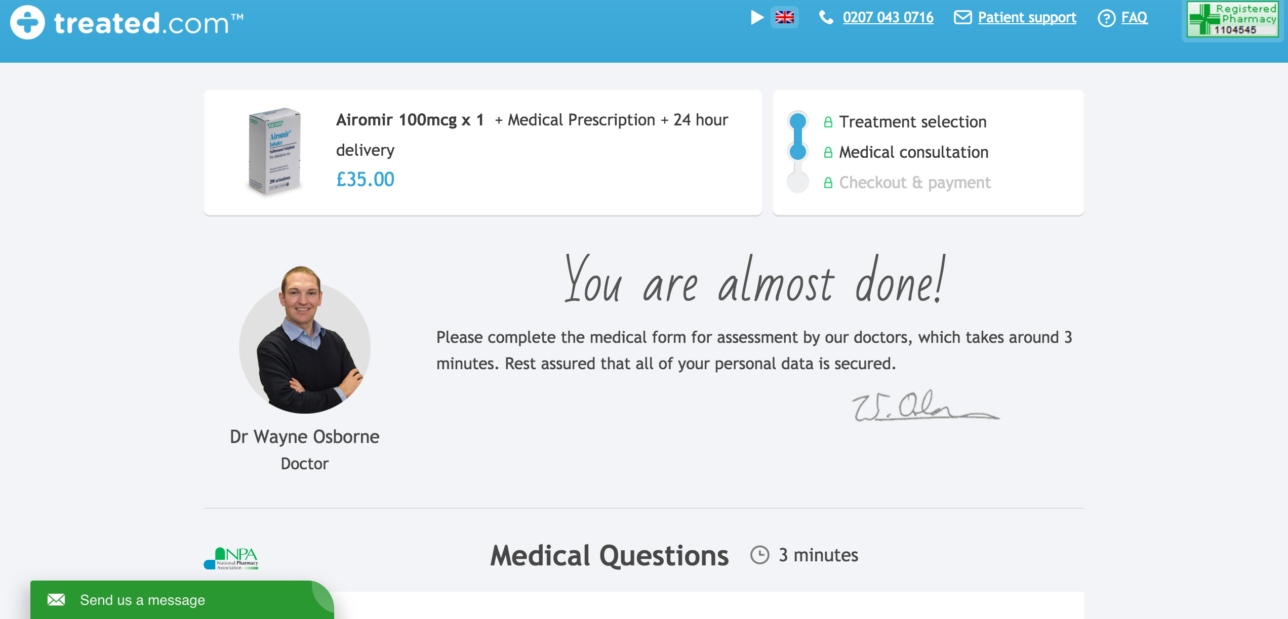
This back-to-basics approach, along with a TV ad campaign, has gained the platform recognition: they were nominated in the 2016 eCommerce Awards for Excellence.
2. Captain Train (Trainline.EU): Mastering the Fundamentals
Customer service centres for travel operators are generally not noted, unfortunately, for their inaccessibility. Making or altering travel arrangements can be a time-consuming and laborious process; and often unjustifiably so when you consider the prices customers pay for tickets and bookings fees.
Recognising this, French-based travel agency Captain Train, now part of the Trainline group since being acquired in March 2016, has built its impressive reputation on breaking the travel operator mould; by simply directing its efforts to offering the very best customer service the travel industry has to offer.
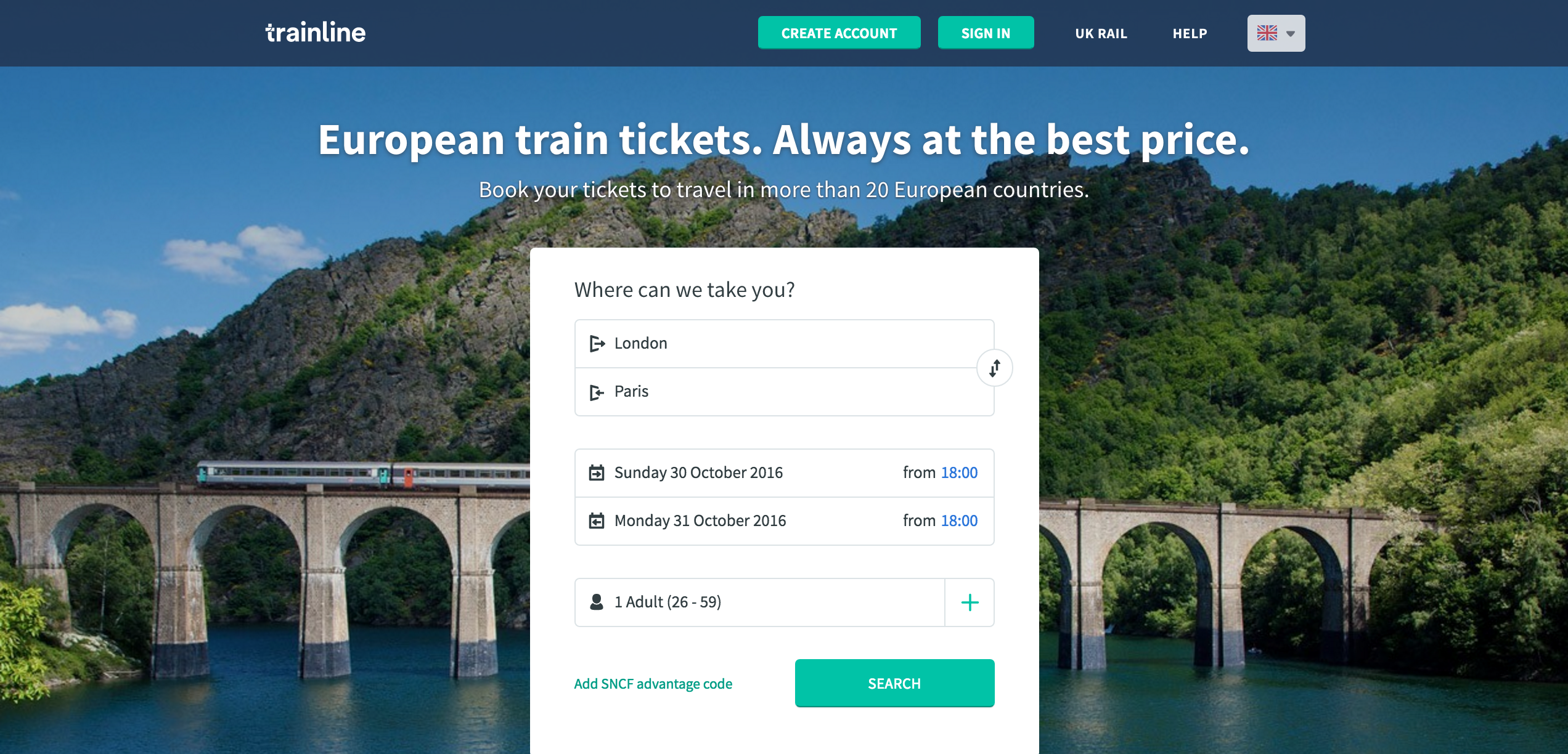
The site boasts an easy and aesthetically-pleased site and mobile app, but there is perhaps no better example of how increasing user engagement doesn’t always have to be about elaborate tech and innovation. Sometimes, just perfecting the fundamentals of customer engagement can be enough to set a platform apart from others (and earn a 2013 Travel d’Or Award for best upcoming site).
3. Klarna: Offering a Safety Feature Your Competitors Don’t
Payment gateways are fast becoming the industry standard for online retailers; of which PayPal is the undisputed market leader. So in order to persuade retailers to adopt a lesser known or fledgeling service, it’s crucial to develop a strong USP to make your brand distinctive.
Swedish payment site Klarna, which launched in 2005, have decided to implement a security feature which the competitors don’t have: the delayed payment process. The Klarna gateway permits the customer to order an item online and then pay later, once they’ve received it (during this period, Klarna supplies the funds for the transaction to the retailer, prior to collecting it from the customer at a specified time).
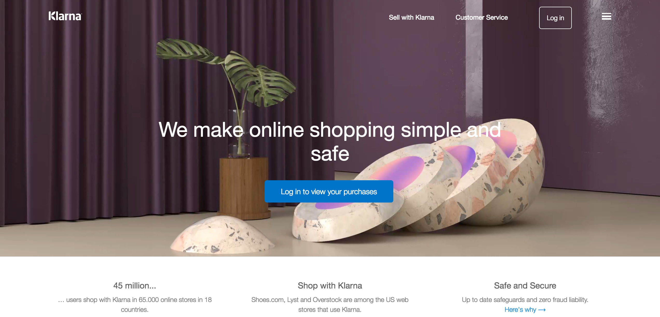
It’s a feature which companies are finding increasingly more attractive, as it facilitates trust between users and retail platforms. It’s also a feature which has helped to establish Klarna as a company to watch; it was included in the European FinTech Top 100 in 2016.
4. Halifax: Recognising the Power of Apps
Halifax have stated that two thirds of their clients who have access to their online banking services do so on their mobile; and it’s little wonder when you consider how comprehensive and honed their platform is.
The bank has won praise, along with Barclays, for pioneering mobile banking apps. Halifax’s offering deftly tempers ease of access and security. Users simply sign in with their unique passcode, and can undertake all their necessary everyday tasks, such as getting an up-to-date balance (which displays all those pending payments you might otherwise lose track of), transferring funds and managing standing orders.
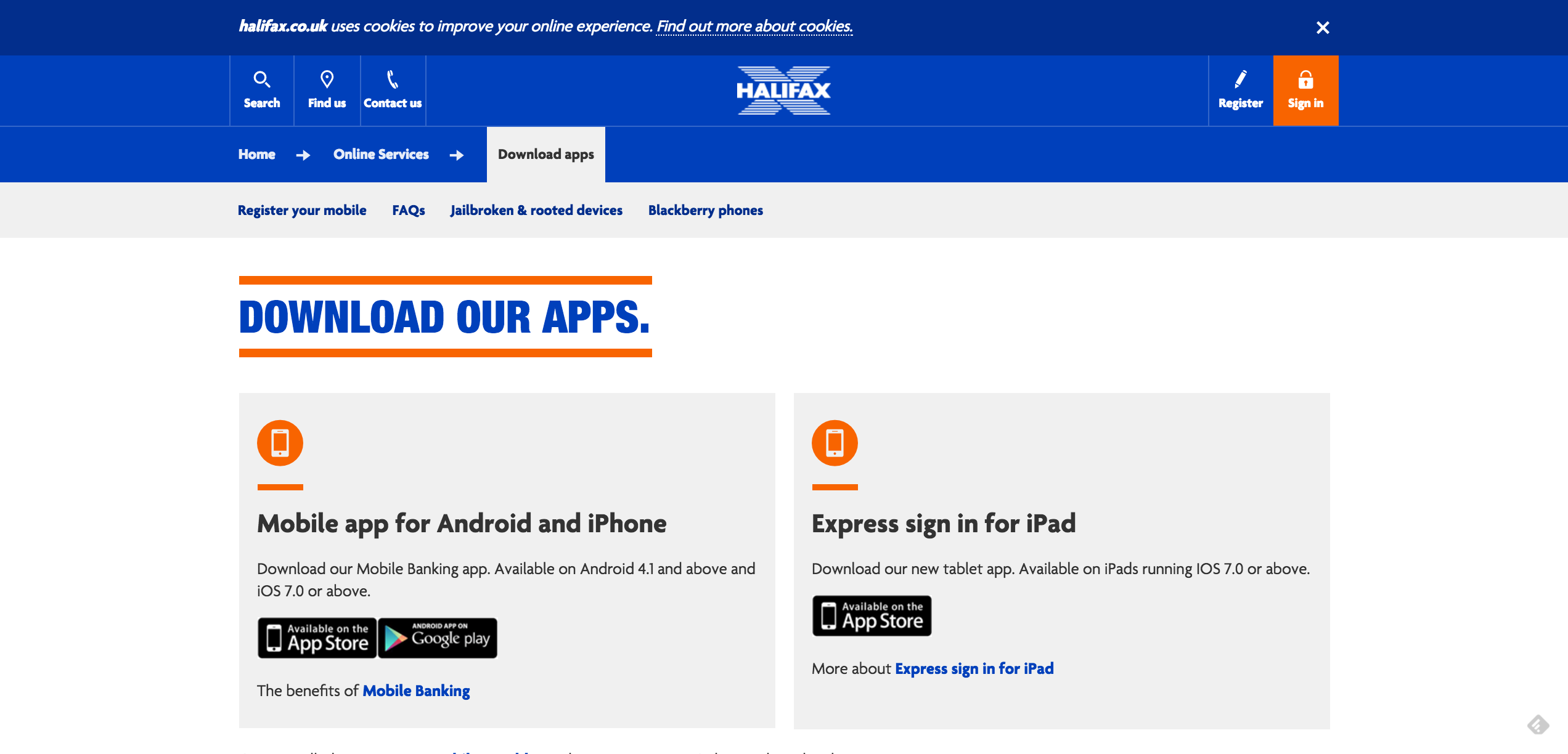
But it promotes even greater engagement by permitting users to readily access information on new products, such as saver accounts and credit cards, and apply for them (without having to set up a meeting in branch or over the phone).
5. eBay: Utilising Tech to Increase CTR on Mobile Searches
No-one could accuse eBay of resting on its laurels. Anticipating new competition from Facebook marketplace, the retail giant has been looking into several innovative strategies to refine user experience.
Among adopting image recognition tech in order to facilitate visual searches, and new data enhancement tools from SalesPredict to improve its analytics and targeting, eBay has also brokered a deal with Google AMP (accelerated mobile pages) to load images of items faster on search results.
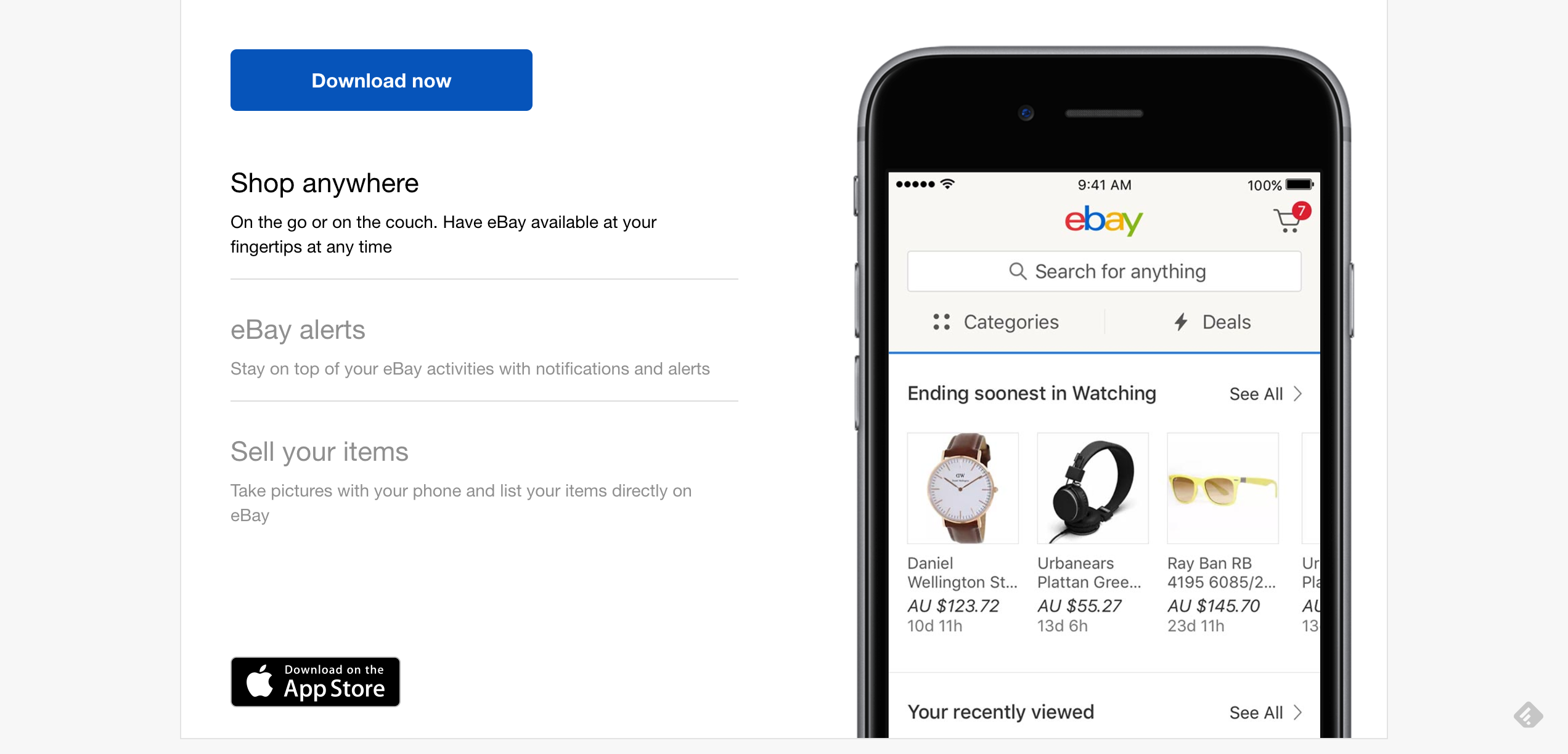
It’s a tool used by news sites to display images next to stories on mobile searches (and generate click-throughs) but, seeing its value in facilitating visual product recognition in a highly competitive market, eBay is reportedly the first to explore and implement this tech in eCommerce.


