Hitwe is the new social discovery dating platform. In this article we take a step-by-step look at the features and functionality provided to those who want to meet real people.
Basics and Background
Hitwe was founded in 2016 with a view to bring dating through social discovery to emerging markets, a simple, inviting logo says “hi” with a heart above the i. Initial success was quick to come by and Hitwe now boasts 20 languages, 200 countries and over 1 million daily active users. Social discovery has opened up dating sites to new audiences, mainly younger, city types, and in doing so has cast aside the dowdy image which had thence far prevailed. Social discovery is more open: users like or dislike a profile based on some photos and simple information, if two users like each other’s profile a chat function opens up, and if that goes well they can progress to a date. Only one step, or criteria, is dealt with at a time, which lends itself to quick visits to the site during lunch breaks or maybe the odd, tiresome meeting.
Each user has a profile which consists of basic information like their location and age, coupled with a brief personal description and a few photos. Their profile can be drawn from their Facebook account by syncing the two which has been a crucial part of Hitwe’s success, contributing to three million app downloads in 50 countries within four months. Users are also able to communicate in multiple ways using both instant messaging and, of course, emoticons.
At the moment the platform uses a freemium model, where certain functionality is available for free with more available if a monthly subscription is paid. Apps have so far been the home of social discovery dating platforms, most often used “on the go”, and as necessary Hitwe has versions for Apple and Android users out already.
Users and Profiles
The users and profiles of any dating app or site are the bedrock on which they are built, all the functionality is secondary to this. The Hitwe profile is a little more substantial than many other social discovery dating sites and apps, on the full website there are multiple tabs and users can fill in plenty of information about themselves from their ethnicity all the way through to whether or not they like TV. Having said that it’s also possible to import a quick photo from Facebook and you’re on your way. This strikes a healthy balance, somewhere between the endless forms on dating sites of old and the more plug-and-play approach of other social discovery dating apps.
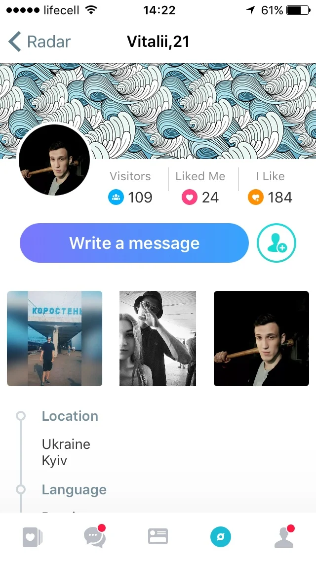
Other people’s profiles are viewed in two forms, the first being a sort of card in the Discovery tab which simply shows their photo, age and location and asks you to click on a heart or a cross. The second can be reached by clicking on their name in the top left of the card, and this gives you their full profile. From here you can see an overview of anything in their profile they’ve completed, how many people have liked them or viewed them and how many people they’ve liked, along with being able to like them yourself, or maybe just send them a sticker or a GIF.
In the full profile Hitwe have also gone a step further than most social discovery sites, and in doing so they’ve taken a step towards social media. Users can upload a cover photo, as well as their profile photos, which sits along the top of the profile with their stats just below it and the rest of their information below that. It certainly has the feel of a Facebook profile, but then more information leaves one better able to form an opinion on their potential next date.
Features
Most of the features used on the site are what you’d expect, though this is not meant in the pejorative. The use of cards to like or dislike, the instant chat function and many other things have done so well in the past that it would be folly to change them. But Hitwe does have a number of other features which are new to social discovery dating sites and apps, and some will be the kind of thing you’ve yearned for before.
Firstly, being able to see how many people have viewed a profile, how many people have liked it and how many people that person has liked has the effect of taking you out of the dark somewhat. It’s no longer the case that you have no idea where you stand in the grand scheme of things, or whether the person who just liked you actually likes you or is just a serial liker. You may not like the answers to some of these questions but the information is there to be seen and can certainly be an eye opener.
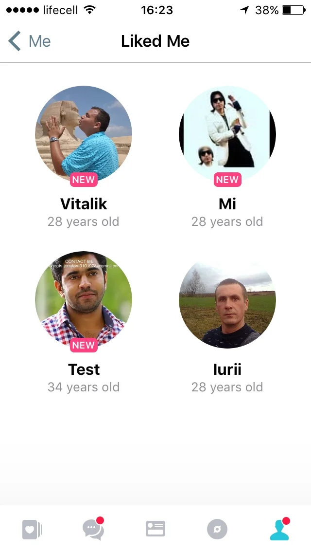
In keeping with this openness of information, users can also see who has liked them, the profiles of people they have liked, and who has looked at their page. This is all available to be seen regardless of whether both users have liked each other or not. This, again, is interesting and perhaps now markets have softened to this type of dating the idea that people can see whether you’ve been looking at their page or not is probably a more welcome one that it used to be.
Free vs Paid Features
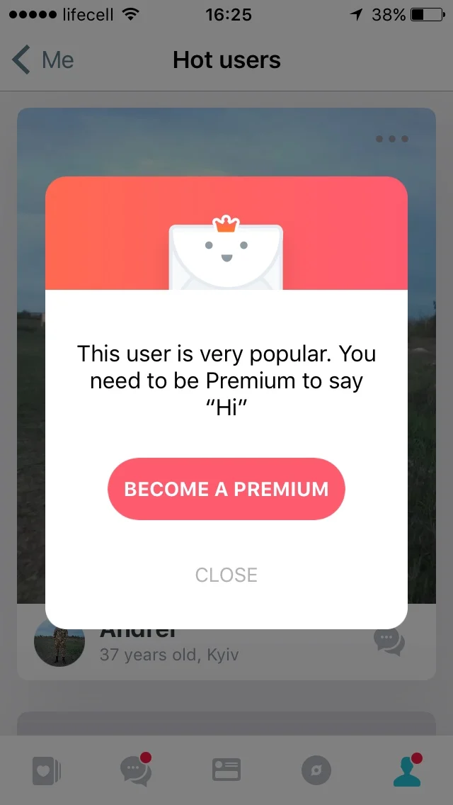
The first thing to say here is that the premium version (which is $7.99/month) removes the adverts for you. I’m willing to bet we all find these irritating, and they do have a habit of popping up at irritating moments, especially on the app where space itself is at a premium. But, more than that, the premium option means that you and your profile will be treated in a premium way.
Messages from premium users will appear above other users, all the easier to start flirting with. Premium account are also shown ten times more often than other accounts, including in the ‘Messages’ and ‘TOP-users’ sections. So this is an easy way to separate yourself from the pack and is definitely an interesting twist, since users who don’t pay and simply upload a Facebook photo are unlikely to be taking the whole endeavour as seriously as someone who has paid to use the platform.
The premium version does also offer added functionality. You’re able to save an unlimited number of contacts which couples with other functionality allowing you to text or like anyone on the site, including other TOP-users. You’ll be able to boost your ability to meet new people, and you’ll get more information in being able to receive a notification when your messages have been read. Overall the premium option is for the user who will take Hitwe more seriously, but in return they get some serious functionality to help them on their way.
Advantages vs Disadvantages
Most social discovery platforms are app-only, but Hitwe have gone for having a site as well which has the big advantage of being able to build out fuller profiles. This feeds into two themes of the site already briefly mentioned. The first is to appeal to people who will take online dating more seriously than they might on pure social discovery apps, where there is a tendency to view everything as a game. Using an app while you’re on the bus to work is absolutely essential for the usability of platforms like these, but what the others might’ve overlooked is a willingness in users to also sit down one evening and finesse their profile, or peruse others more carefully.
The second is linked, but slightly different, in that a desktop site allows more information to be displayed on a profile. This has the knock-on effect of being able to add functionality which otherwise wouldn’t fit in on a mobile phone screen. Options like seeing how many likes or views other people have are things which, together with all the other information, require more space.
There aren’t necessarily clear downsides, but there are areas which will be interesting to develop
The next thing to keep a close eye on is the stats displayed on each page: number of likes, number of views and number of people liked. These are certainly good to know and will be useful in the sites early days. But as with other social media sites, over time users may learn to play up to these stats viewing them as the ultimate goal of this game they play. Of course, this may not happen, but hence why it’s worth keeping on eye on the way it develops.
The Apps
The apps are in many ways the most important part of social discovery dating platforms. They allow users to enter the site quickly and perhaps briefly every now and then or whenever takes their fancy. It’s also the part which has opened up online dating to younger audiences and removed its stigma. The Hitwe app has stuck to good principles here and gone with what works, but the best of what works.
The app allows you to access all the essentials of the full site without a desktop. The Discovery and Feed tabs are there which form the bread and butter of the platform’s existence. The chat function is a key goal of any user so that takes a firm place on the second tab.
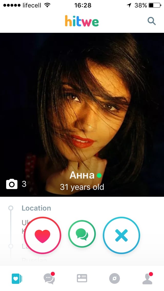
You can see your profile, make updates and tweak your settings – all important stuff. The simplest but most pleasing part of the functionality is that when you scroll through the cards in the Feed or Discovery tab you can swipe left or right to view more photos. This removes the irritation of having to click into someone’s card to start viewing their profile and photos, and adds to the ability to use the app quickly.
The final tab to mention is the Radar tab, which allows you to search for people nearby. The goal of using a dating app is being able to set up a date if all goes well, which would be tricky if people aren’t near you. However, being able to select the location you’re searching in whilst also allowing you to search nearby gives you the best of both worlds.
How to Stay Protected from Scams and Spam
Hitwe grew fast and, as with any fast growing company, this presented some challenges. People running scams are always out for the newest popular website on which to operate, on the understanding that the site will be less equipped to deal with unwanted user-types. This was true for a brief period of time as Hitwe was inundated with scammers and con artists trying to extort money from other users on the site. But Hitwe has responded with similar force and now seems up to scratch in tackling the problem.
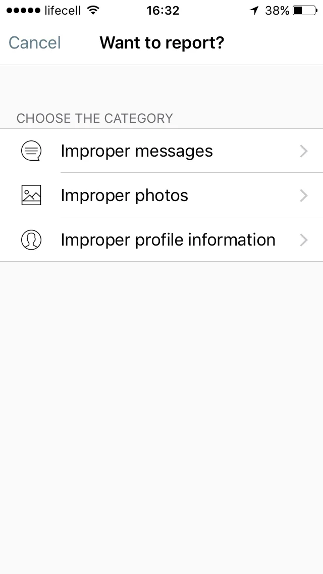
It’s difficult to tell scammers from non-scammers at times, the difficulty lies in drawing a line between the two and on what criteria. Hitwe have gone for an intelligent approach here, on the one hand using algorithms (Google Cloud Vision API) to sift out as much as possible, but ultimately passing the responsibility of the final decision on to a human.
The moderators – a team of over 40 – take a look through the offending profile and pick up on a number of criteria which Hitwe have been quick to identify. Any pictures which contain text or are of a celebrity are immediately suspicious. But beyond scam is also spam, which is a far lower level irritant but also more numerous. In this Hitwe say one complaint is potential enough to suspend an account. The combined effect of this is that spam levels have been reduced to 1-2%
Awards and Recognition
Hitwe has understandably come in for a decent amount of kudos given its slick UI and rapid growth. 10 million people are reached by daily posts, numbers that pretty much any website would aspire to, and over 500,000 video views. Initially this has given them top 10 app status in over 50 countries according to AppAnnie. And in September 2016 Hitwe exceeded the 10 million uploads mark on Google Play. But their best success has been with Facebook. Pairing the two sites has meant it’s much easier for users to join Hitwe to begin with, and has provided a big boost to new user levels.
Hitwe succeeded in achieving huge cost decreases thanks to the Facebook platform integration and this, coupled with the huge numbers of new users, prompted Facebook to write Hitwe up as one of their success stories. Not only that but once Facebook’s Cross-Border Business Handbook came out, Hitwe were on the cover.
Conclusion
You can think of Hitwe as a sort of ‘Best of…’ album of social media and online dating platforms through the ages. As is sensible most of the thinking has come from the more recent iterations to these two fields, and they’ve thrown in a few fresh ideas on top for good measure. By blending the two slightly online dating is almost coming full circle, but with its feet firmly planted in social discovery. This is another departure from the pure card format of swiping right and left, providing users more information and more functionality.
These steps have been inevitable as a newer, younger market has become more accustomed to online dating. And this new platform laying profiles out in a different way will be at once familiar but also a departure from what’s already out there. One thing is for certain, websites and apps which may or may not fulfil a market need don’t grow as fast as Hitwe; only when they’ve got it right do they grow this fast.


