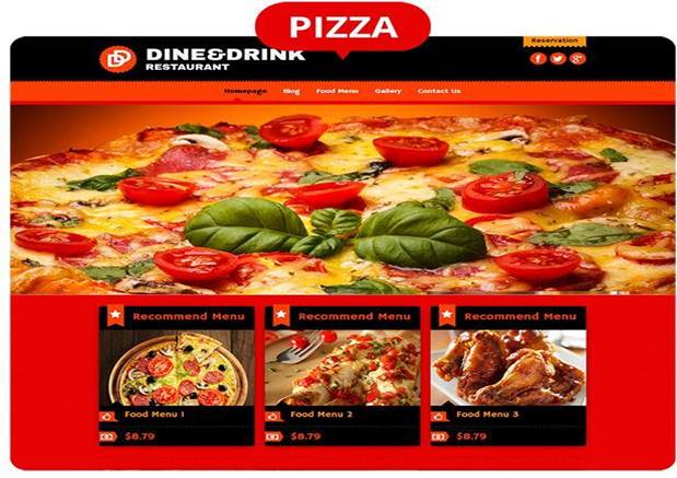
If you want to triumph over other competing restaurants and come out on top, your local restaurant needs a website! As a restaurant owner, having a website for your place is great. If your restaurant has a site, you have a total control over the information that goes out there.
For example, working hours, menu information, photographs, etc. In 2017 every other customer checks the Internet before visiting one or another place to have a dinner at. The webpage is not only an ad but also a great source of information for your potential visitors. And how it looks define whether they will be interested in your place or not.
Today, we’re going to talk about what customers are looking for when visiting a restaurant website and what principles you should use when creating one by yourself. But first of all, let’s deconstruct the stereotypes and the myths that you have to hire a whole team of professionals for this purpose. The truth is opposite. You can make a good restaurant page by yourself. How? All you need to create restaurant website is restauranthill.com builder or any other you like and a couple of useful recommendations, which we’re going to provide further. Creating a website doesn’t cost a fortune and doesn’t take a lot of time. Just be ready to spend at least an hour, and you’ll get a beautiful, and what is more important, a professional-looking online page.
So, let’s get started.
Efficient Website
What does it actually mean «an efficient website»? It is a website, which provides Internet users with all needed information they are expecting to get from this page.
Information and Navigation
If a person visits your restaurant site, he/she expects to get a menu, a contact information, and a price list in one click only. Visitors hate searching for a needed information for more than a couple of seconds. If they can’t find how to get to your place and what food they can eat there, you lose the clients. They don’t care about your chef, awards, site animation, autoplay music or something like that. First of all, they look for two basic things:
- Food;
- Location.
So, make sure that the navigation and the directions on your website will be equally understandable for every visitor.

Pictures
Statistics show that websites with pictures are more attractive for the visitors. But make sure the photographs you place on your website are not of a bad quality. They should be related to your cuisine, menu, location, etc.
What Not to Post
Don’t offer your clients to download any kind of attachments like a menu, location scheme, restaurant history on their computers. Almost no one ever does this. Time is precious for everyone, including your customers. So, they don’t want to bother themselves by spending a couple of minutes on typing, clicking, downloading any kinds of information from your website. They want to be able to find all needed data online.
Remember, that creating a successful website depends on understanding how the web marketing is working and what your customers are looking for. Hopefully, these tips will help you to create a wonderful and efficient website for your own restaurant too.


