
After redesigning the Gmail and Reader interfaces, Google’s now turned its attention to Search.
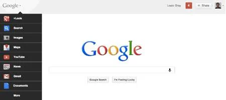
It’s getting rid of the black navigation bar – which only appeared in June – in favor of a drop-down menu that it says will allow for easier and quicker navigation. The search bar will appear in the center of the screen in much the same way as before.
There’s no massive changes to get used to. The menu links directly to Google+, Web Search, Image Search, Google Maps, YouTube, Google News, Gmail and Google Docs, with lesser-used services under the heading ‘More’.
These include Google Wallet, Google Offers, Google Music, Google Mobile and Blogger.
Google+ tools appear on the right of the screen, with the aim of boosting the social networking platform by making it easier to share content.
“Instead of the horizontal black bar at the top of the page, you’ll now find links to your services in a new drop-down Google menu nested under the Google logo,” says technical lead Eddie Kessler on the company blog.
“We’ll show you a list of links and you can access additional services by hovering over the ‘More’ link at the bottom of the list. Click on what you want, and you’re off.”
Google’s started rolling out the redesign already, and it should be available to all within the next few days.