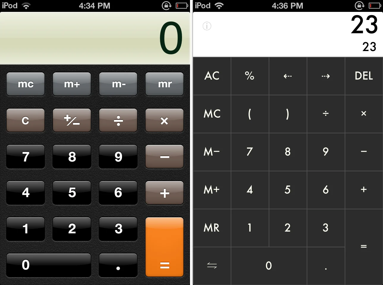
Yes, it has finally happened, Microsoft has gotten ahead of the curve. That tile thingy interface for Windows 8 is just what Apple needs.

Designers are precious people who till the soil of their imaginations to grow trees of ecstasy that help all of us lead better, more productive lives. Don’t let any non-designer person tell you otherwise because they don’t get it. They are likely to have hair on the palms of their hands and eat babies at night.

So, we should all be grateful that the design world is fighting for the very soul of technology by arguing about the dawn of the age of Flat Design. The correct title for any parlor game you may want to organize at your next shindig is: flat design versus skeuomorphic design – duke it out. It is a serious subject and we should all join the global discussion to decide whether stuff on our phone interfaces should be flat or look like the stuff it is mean to be.
Sadly, no one outside of the design community will care and most of us will think that Flat Designs look, well, flat. While skeuomorphic designs may not be practical at all times, they will look prettier and kind of the way we want our tech to be: all gleamy and 3D-ish and stuff.
Of course, the possibility exists that you can be both flat and skeuomorphic but that seems like we’d be splitting hairs.


