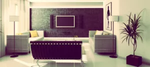
Minimalism principles involve making décor feel expansive, not merely eliminating as much as possible. If you have a few minutes, I’d like to show you several ways for designing a minimalist paradise (that doesn’t break the bank) you can do in a weekend.
1. Lights
Light is as vital in minimal spaces as larger furniture – least of all for making rooms feel more spacious. Use window treatments to accentuate natural and make your space feel wider. When you’re decorating your light fixtures, always go LED. It’s been proven that led bulbs are leaps and bounds more efficient than fluorescent and incandescent bulbs. Here’s why:
- LEDs require less watts, meaning they use less power (saving you money)
- Have a longer lifetime (some last 40,000 hours)
- Contain no toxic mercury
- Are more durable and less inclined to accidentally break
2. Quality vs. Quantity
Minimal interior spaces require high-quality materials and décor to maximise the effect. To ensure the highest quality, you may have to splurge on more expensive furniture and well-made pieces. Make sure they are unique and personable to your own character. You can shop around at your local thrift stores, hardware stores or online retailers for minimalist home décor.
3. Balancing 101
Be strict about your furnishings. Studying basic interior design principles will teach you first-hand lessons in proportion and spatial harmony. Keeping spacious rooms filled with light and implanting wide sight lines is fundamental.
For example: one side of your room should never feel “heavier” than any other side – such as having a sectional couch on one side of your living room and recliners on the other side.
Anything you put in your home must follow these basic principles:
- Simplicity over complexity – regardless of aesthetic and function
- Clutter-free, clean and open
- Always vie for visual interest and personality
4. Texture
We’ve talked about adding visual interest to your home. One of the easiest (and fun) ways to do that is by getting your hands on wool upholstery, buying handknit blankets or throw pillows. Another way to add modern texture to rooms is to think “curvy.” Look around for tufted sofas, mid-century chairs (such as bubble chairs) or round glass tables to add stunning geometric contrast.
5. Paint
Minimalism gets a bad rap primarily for one reason: colour. Modern monochromatic colour tones, while beautiful to look at, can make rooms look impersonal and bland. The popularity of black and white colours in recent years in a lot of homes make them feel like “me too” copycats. Pinterest lists exciting colour pallets that shake things up. Earthy neutral colours are a fantastic alternative to black and white schemes.
If, however, you prefer white walls (or are living in an apartment) then opt for practical furnishings and items in colourful, wild hues. This includes pillows, rugs or placemats, towels and upholstery. You can even buy vintage light stands and vases to add special flavour to white-wall rooms.
Conclusion
Aesthetic is only half the battle. The functionality of your home plays an equally important role. In a nutshell, the main principle of minimalism design is to comfortably live with less while emphasising aesthetic beauty. If you truly want to make your home a minimalist paradise, practice self-restraint (which further develops your confidence, which never hurts).


