Chicago (IL) – Historically, moving from a 1.x to 2.0 version suggests a host of new improvements. Sadly in Google’s case, their Chrome 1.0 moving to 2.0 is just a marketing trick like the one we saw three months ago when Google removed the BETA label and proclaimed Chrome to be a finished product. On the bright side, however, 2.0 beta does feature a faster Javascript
engine that could be reason enough to upgrade. They’ve also updated the WebKit rendering platform which enables full-page zoom and three other features that will find
its audience. The question is: Will this “major” new version, once it
comes out of beta, fall on deaf ears?
All along I’ve been saying Chrome wasn’t yet ready for prime time. This past
December, when Google simply removed the BETA label from the then current
0.4.154.22 Chrome version, I wrote
that it was purely a marketing move designed to increase Chrome’s web
usage share. Simply put, the resulting 1.0 release was only as stable as the beta was and it brought no new features or improvements to
justify removing the beta label. Since then, Google has released
several maintenance updates to Chrome, bringing the current stable
version to number 1.0.154.48.
While Google publicly acknowledged
they’ve been developing new features for Chrome, we expected the company would simply update the current Chrome version whenever the new
release is ready for prime time. Instead, the search
giant decided to keep its current version where it is and release a new beta
version, giving users the opportunity to test its new features — so the
company could tweak the code. Of course, that’s nothing out of
ordinary. Other browser vendors also release beta versions of upcoming
releases in parallel with current stable versions, often times with a link appearing immediately by the stable download link on their sites.
With Chrome,
if you want to install the new beta version, the installer will switch
you to Google’s beta channel, replacing whatever Chrome version you had
installed with the latest beta, which is version 2.0.169.1. Unlike rival
browsers, there is no way to keep both versions of the
browser install on the system at the same time. And to make matters even more confusing, you can
opt for the developer’s channel as well, which brings you the least stable
Chrome releases that should serve only as test bed for features that may (or may not)
end up in ordinary beta releases.
We sincerely hope Google will
abandon this awkward and confusing system, opting instead for a more common intuitive approach allowing
us to run both stable and beta releases of Chrome on our computers at the same time.
With that off our backs, let’s take a closer look at new features that
Google has in store for Chrome.
Faster V8: Speed, give me what I need
Google
claims that the first thing you might notice about this new beta is its speed improvement. How true! I’d started out by running beta on a
low-end netbook and immediately noticed snappier performance. Google
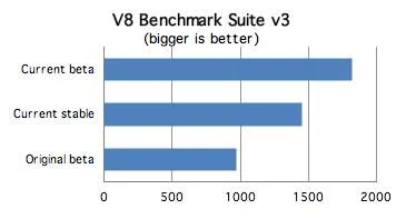
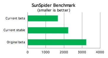
says the new beta performs 25 percent faster on Google’s V8
benchmark (known to be skewed towards Chrome’s V8 engine), and
a whopping 35 percent faster on the common Sunspider Javascript
benchmark — compared to its current stable version. In addition, the company claims that the browser is nearly
twice as fast as the original beta
version.
Time for a reality check.
Pages do seem to load faster
while complex web applications are noticeably snappier, especially
sites like Gmail and Facebook. On top of that, the user interface
appears to be even more responsive than before.
While the
overall sense of speed improvement is there, it doesn’t feel as fast as Google’s tests should indicate. Of course, these benchmarks should
always be taken with a grain of salt since they measure only the
Javascript engine — disregarding other engineering tweaks and
architectures that contributes to how fast the browser is in everyday
use (such as network latency, one factor alone which can make browsers appear extremely slow in some aspects).
Let me put it this way: Speed has always been Chrome’s biggest
advantage thanks to an entirely new byte-code optimized Javascript
engine, dubbed V8. It’s a fresh design and modern architecture that isolates tab
processes and supports internal memory protection and multitasking. Because
of this, the current Chrome version is, in my subjective opinion, the most
enjoyable browser for everyday use when it comes to speed — particularly
in web applications and heavy-load scenarios with several dozens of
tabs opened at once. With that in mind, any improvements built upon an already speedy engine is surely a welcome addition, and one which further increases the speed gap between Chrome and rivals.
While
speed gains in this beta are apparent, they are not huge or
groundbreaking and, frankly, don’t seem 30% faster than the
current stable version.

V8 GETS A NITRO-BOOST
Google’s
own V8 benchmark (above) and common Javascript benchmark called
SunSpider (bellow) suggest the new beta version of Chrome is 25
percent faster than the current stable version and nearly twice as fast
compared to the original beta version. In real life, however, while you do feel
noticeable speed gain in complex Javascript-based sites, the speed gains don’t seem as substantial as the benchmarks
suggest.

Read on the next page: Tab-dragging, Full-page zoom, Auto-scrolling
Side-by-side view from tab-dragging: Great for research and comparison
Chrome
allows you to quickly realign your view by dragging tabs to five preset
docking positions — just like how Windows 7 lets you drag a window to
either side of a screen to resize it vertically to exactly half screen
for a quick side-by-side view of two windows. The five docking
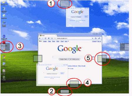
positions in Chrome and their corresponding functions are as follows:
- The top of your monitor, in the middle: The tab appears maximized in a new window when you release it.
- The bottom of your monitor, in the middle: The tab appears in a new window that fills the lower half of your monitor.
- The
left and right sides of your monitor, in the middle: The tab opens in a
new window that fills up either the left or right half of your monitor. - The
bottom of a browser window, in the middle: The tab appears in a new
window below the existing browser window. The two windows splits the
monitor in half. - The left and right sides of a browser window,
in the middle: The tab opens in a new window that fills up either the
left or right half of your monitor. The existing browser window takes
up the other half of the monitor, so that the two windows appear
side-by-side.
It takes a bit of time to remember and
get used to these hot spots. Once you master them, however, they can
enhance web surfing, especially if you need to compare two pages
side-by-side during web research.

DOCKING POSITIONS
Chrome 2.0 beta features five preset docking positions to quickly snap browser windows to convenient position. Simply drag tabs to one of these locations until an icon appears, then release the mouse button.
Full page zoom: Finally!
The
new Chrome beta finally gets full page zoom. This seemingly irrelevant
feature works to proportionally enlarge all elements that make up the
web page when you zoom in, not just the typeface. This lets you zoom in
an entire web page, which comes as a life saver to reduce eye strain
when viewing web pages on large displays. Chrome inherited this
capability thanks to a new version of the WebKit rendering engine
responsible for turning HTML code into a visual representation of a
page.
I don’t know about you, but I’ll be using this feature a lot.
Since I’ve developed an astigmatism in my old age (surely due to starring at all kinds
of displays over the past 15 years), I know I’ll be using Chrome a lot more
often just for the sake of the full page zoom.
The addition of this
feature leaves the current stable version of Safari and Internet Explorer
as the only two browsers that lack this feature. Current Firefox and
Opera versions, as well as the latest beta versions of Safari and
Internet Explorer, all feature full-page zoom (F11 key).
Auto-scrolling: Navigation enhancement
Another
cool feature (courtesy of the updated WebKit version) is auto-scrolling. Activated by clicking the
middle mouse button (or mouse wheel), this feature simply lets you
scroll the page automatically up or down. While it may take some time to get used to it,
auto-scrolling will quickly get under your skin as it enables you to
navigate pages a lot faster than grabbing window’s scroll bar or
hitting up and down arrow keys on your keyboard.
Read on the next page:Forms auto-fill, Conclusion, Video of the new side-by-side view by tab-dragging
Forms auto-fill: Half-baked
The
lack of a decent forms auto-fill feature is another glaring omission making you wonder how on Earth Google could have removed the BETA label from
Chrome. Found in all rival browsers, forms auto-fill lets a browser
remember the text you entered on websites to save time typing it back in the next time.
In the new Chrome 2.0 beta, forms auto-fill works as you’d
expect. The browser remembers text your enter in forms and
automatically shows what you’ve entered previously the next time you
fill out the same text boxes. But herein lies the problem: Chrome can’t
auto-fill all text fields on a page at once like other browsers do.
Instead,
Chrome displays the remembered text below the field with focus. In order to auto-populate this field with the saved info,
you must select a text field with the mouse or arrows on the keyboard, and
repeat this process for all fields on a page to auto-fill.
This is huge disadvantage
and takes unnecessary time, so we hope Google will tweak the forms
auto-fill feature to behave like you’d expect in time for the stable release.
Just like with
other browsers, some sites prevent you from auto-populating their text
fields. You can turn auto-fill off by deselecting the Save text from forms to make them easier to fill out option found under the Minor tweaks tab in Chrome’s settings panel (accessed by clicking on Options in the Tools menu). To erase records of the text you’ve entered on all web forms, choose Clear browsing data in the Tools menu and select the Clear saved form data
checkbox in the dialog.
By default, Chrome clears only information
collected in the last 24 hours. but you can select a longer period of
time in the Clear data from this period drop-down menu. Alternatively, choose the Everything option to wipe out all form information.
Conclusion: Five features do not justify a “2.0” version
If
you’re like me, you’ll be wondering if four new features and a speedier
Javascript engine justify the full 2.0 versioning. One would expect the beta
version 2.0.169.1 of a browser to pack far more improvements over the current version 1.0.154.48, and if not then to be a 1.1 beta version.
This 2.0 beta simply
updates the browser’s V8 Javascript engine, resulting in overall speed
gains, and throws in the latest WebKit rendering platform that results
in full-page zoom and auto scrolling. On top of that, the company coded
two more feature, 1) forms auto-fill and 2) side-by-side view by tab
dragging — of which 1) seems half-baked.
In reality, with these
four new features, Google is only playing a catch-up game with other, rival
browsers. So then, is the 2.0 beta even worth your time?
Probably, if only for the
speedier performance. Or if you couldn’t care less about faster speed, but
have avoided Chrome in the past due to its lack of full-page zoom and auto scrolling
features, then you should also give it a try. And for the rest who like to
test-drive the latest browser releases, you’re advised to pay attention to
new docking positions for tab-dragging that enhance experience.
While
we still think that Google’s stable, beta and developer channels only
confuse users, we welcome the 2.0 beta for new enhancements. At the same time we maintain that such incremental improvements do not justify jump from
version 1.0 to 2.0, but rather should be called 1.1.
This 2.0 version is obviously a continuation of Google’s marketing practice aimed at improving Chrome’s web usage share. If history is any indication,
Google can only grow Chrome’s share by bringing new features that
users want.
The five new features in 2.0 beta are but a minor part of the broader feature set we’ve been clamoring for in Chrome. Until they
arrive, this 2.0 beta should keep us occupied for some time. According to
the Net Applications’ ongoing stats, Chrome’s web usage share remains
virtually unchanged, barely hovering above 1% mark during work
days and surging above 1.2% over weekends (presumably when people are willing to try new things at home).
SIDE-BY-SIDE VIEW: THE KILLER FEATURE?
With full-page zoom, auto-scrolling and forms auto-fill, Chrome 2.0 beta is simply playing catch-up game with rival browsers who have had all these features for quite some time. The ability to drag tabs and quickly setup a side-by-side view, like in Windows 7, is the only feature we see missing in other browsers. Here’s how you can quickly set this view by dragging a tab to either side of the screen, which comes in
handy for comparing stuff during web research.
(No video? Watch it on YouTube!)


