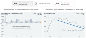
In the 1830’s abolitionists discovered the rhetorical potential of re-conceptualizing southern newspaper advertisements as data. They “took an undifferentiated pile of ads for runaway slaves, wherein dates and places were of primary importance … and transformed them into data about the routine and accepted torture of enslaved people,” writes Ellen Gruber Garvey in the book Raw Data is an Oxymoron. By creating topical dossiers of ads, the horrors of slavery were catalogued and made accessible for writing abolitionist speeches and novels. The South’s own media had been re-contextualized into a persuasive weapon against itself, a rhetorical tool to bolster the abolitionists’ arguments.The Latin etymology of “data” means “something given,” and though we’ve largely forgotten that original definition, it’s helpful to think about data not as facts per se, but as “givens” that can be used to construct a variety of different arguments and conclusions; they act as a rhetorical basis, a premise. Data does not intrinsically imply truth. Yes we can find truth in data, through a process of honest inference. But we can also find and argue multiple truths or even outright falsehoods from data.Take for instance the New York Times interactive, “One Report, Diverging Perspectives,” which wittingly highlights this issue. Shown below, the piece visualizes jobs and unemployment data from two perspectives, emphasizing the differences in how a democrat or a republican might see and interpret the statistics. A rising tide of “data PR” often manifesting as slick and pointed infographics won’t be so upfront about the perspectives being argued though. Advocacy organizations can now collect their own data, or just develop their own arguments from existing data for supporting their cause. What should you be looking out for as a journalist when assessing a piece of data PR? And how can you improve your own data journalism by ensuring the argument you develop is a sound one?


